early childhood education
the learning adventures of tank & tilly
Mobile App
The Learning Adventures of Tank & Tilly is an early childhood education app designed to help young users learn about emotions and empathy. By gamifying the learning experience, the app puts the learning needs and interests of the user first, engaging them through the use of storytelling, multiplayer features and reflection activities.
Project Duration: January 2024 - April 2024
project overview
My Roles: UX research, UX/UI design (LEAD), Graphic design
Responsibilities: Conduct user research and interviews; perform competitive audits; define the problem and provide insights to inform the ideation phase; prepare user personas, user journeys, empathy maps, and user flows; establish a sitemap and information architecture; design paper and digital wireframes, low-fidelity prototyping, high-fidelity mockups and prototyping; conduct usability studies, accounting for accessibility; iterate on designs and responsive design.
Tool: Figma
-
The Problem
I want to design an accessible learning tool that will provide young users with a sense of agency while enabling them to learn about and manage their emotions and develop empathy for others. Current apps on the market are typically designed for a single user only, and lack parental controls, notifications, and continuing education tools which would allow parents of young users to monitor and participate in their child’s learning.
-
The Solution
My early childhood education app will help users learn about and process their emotions while developing empathy for others as they engage in reading, play, and reflection activities centered around these developmentally important issues. I will measure the effectiveness of the app by tracking account holders who are engaging in multiplayer activities, and surveying parent accounts to determine participation levels and use of companion learning tools.
understanding the user
In order to ensure my design would meet the specific needs of the user, I conducted research and organized my findings to identify common pain points so that I could create a user persona to represent the target user group.
user research
-
Summary
In order to understand the target user and their needs, I interviewed parents/guardians of young children (ages 2-12, with and without disabilities) who have prior experience with digital learning tools. My research goals were to: understand the processes and emotions that people experience around the problem my product is trying to solve, identify common user behaviors and experiences with tasks that my product is trying to address, understand user needs and frustrations as they relate to the product I’m designing, and identify the type of product typical users find most engaging and useful in meeting their needs. Through my findings, I was able to identify clear user pain points which I used to build user personas to represent the target audience I would be designing for.
Interview Questions
What is your/your child’s experience with digital learning tools?
Do you and your child use these tools together, or does your child use this tool for independent learning?
What are your thoughts about this?
What does the process of using these products typically look like for you/your child?
How do you/your child feel when using these products?
What do you find to be the most engaging parts of these apps for you/your child?
What about these products do you/your child find frustrating?
How often do you/your child use these tools?
Do you feel these products are successful in meeting your/your child’s needs?
What do you wish were different about them, or is there anything you feel is missing from these products?
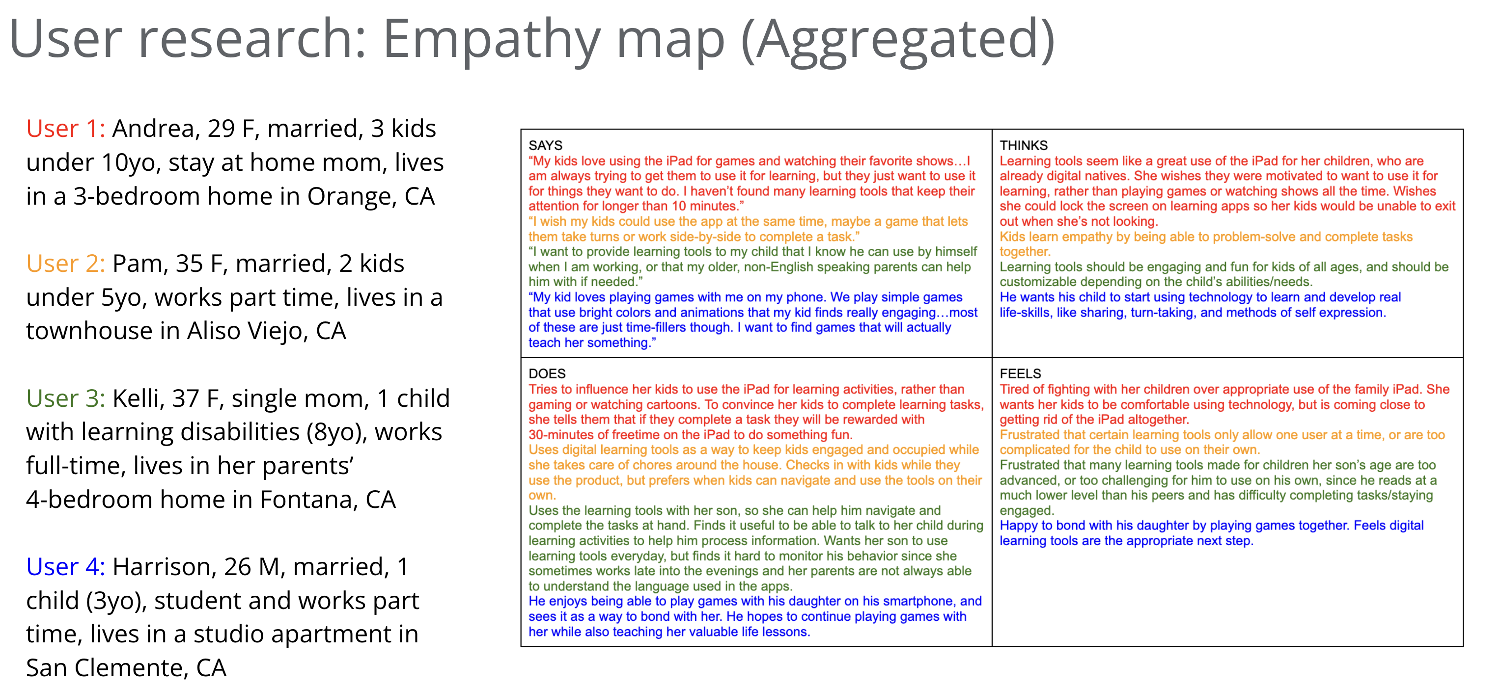
Empathy map:
-
Pain Points
Kids not engaged: Some users are disengaged from the educational aspects of the apps, and only want to use tech devices to play games or watch their favorite shows.
Single-user only: Single-user apps don’t allow users to complete learning tasks with others, making the tools less enjoyable/ideal for families with more than one child.
Not accessible: Parents are frustrated with digital learning tools that are too difficult for their children to use on their own. Apps lack customizable features, such as language support, making them inaccessible for some users.
No parental input: Parents are concerned they don’t always know what their child is learning, and therefore can’t engage with them to discuss their lessons, as they are unable to use the apps with them and/or monitor their progress.
-
User Personas
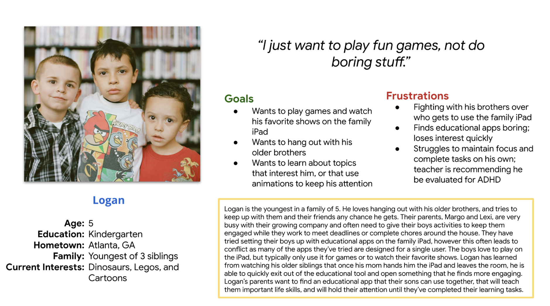
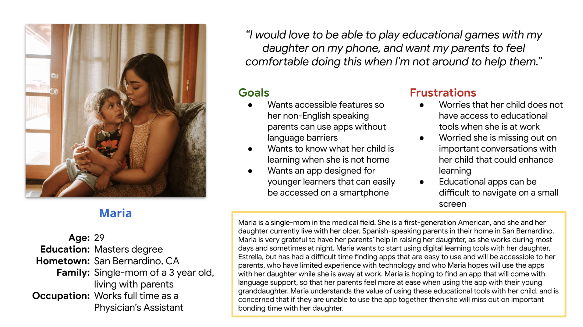
I created two fictional personas to represent my user groups. I referred to the persona of "Logan" throughout my design process to make sure I created user-centered designs.
Problem statement: Logan is an energetic 5 year old who needs engaging and collaborative educational tools so that he can complete learning tasks with the support and camaraderie of his older siblings.
-
User Journey Maps
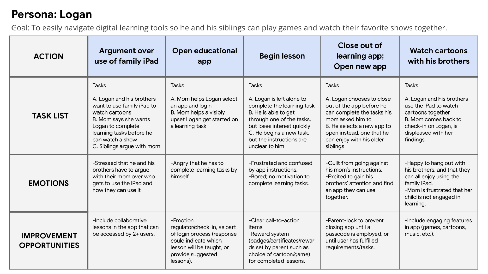
Logan’s user journey revealed the need for collaborative activities with engaging features to keep him interested in the app. Providing a reward system could motivate Logan to want to complete learning tasks. Clear call-to action items and visuals will make for easy navigation and an enjoyable user experience overall.
A parental lock will address the parent’s concern for their child’s ability to easily close out of the app.
-
Competitive Audits
I conducted a competitive audit, which allowed me to learn about the successes and shortcomings of other similar products already on the market. I also read user reviews to learn what people enjoy most about these products, as well as their frustrations.
I compared direct and indirect competitors based on their general information, first impressions, and overall UX, including features and interaction, visual design and content. I discovered that many of my product competitors shared a few things in common, such as the use of bright, bold colors, friendly and relatable cartoon characters, and some kind of storyline for young users to follow along with. I also noticed some key differences between these products, and took note of which features I believed would best suit my design. Below are links to my competitive audit, as well as a written report of my findings:
Competitive Audit - Educational apps (Emotions and Empathy) Competitive Audit Report - Educational apps (Emotions and empathy)
INITIAL CONCEPTS
I reflected on my findings from the competitive audit and related them back to my user goals to come up with many different solutions to the problems I was trying to solve. I began generating ideas through creative exercises, so that I was sure to think outside the box for solutions that may not be readily apparent.
ideation
-
Rapid Sketching
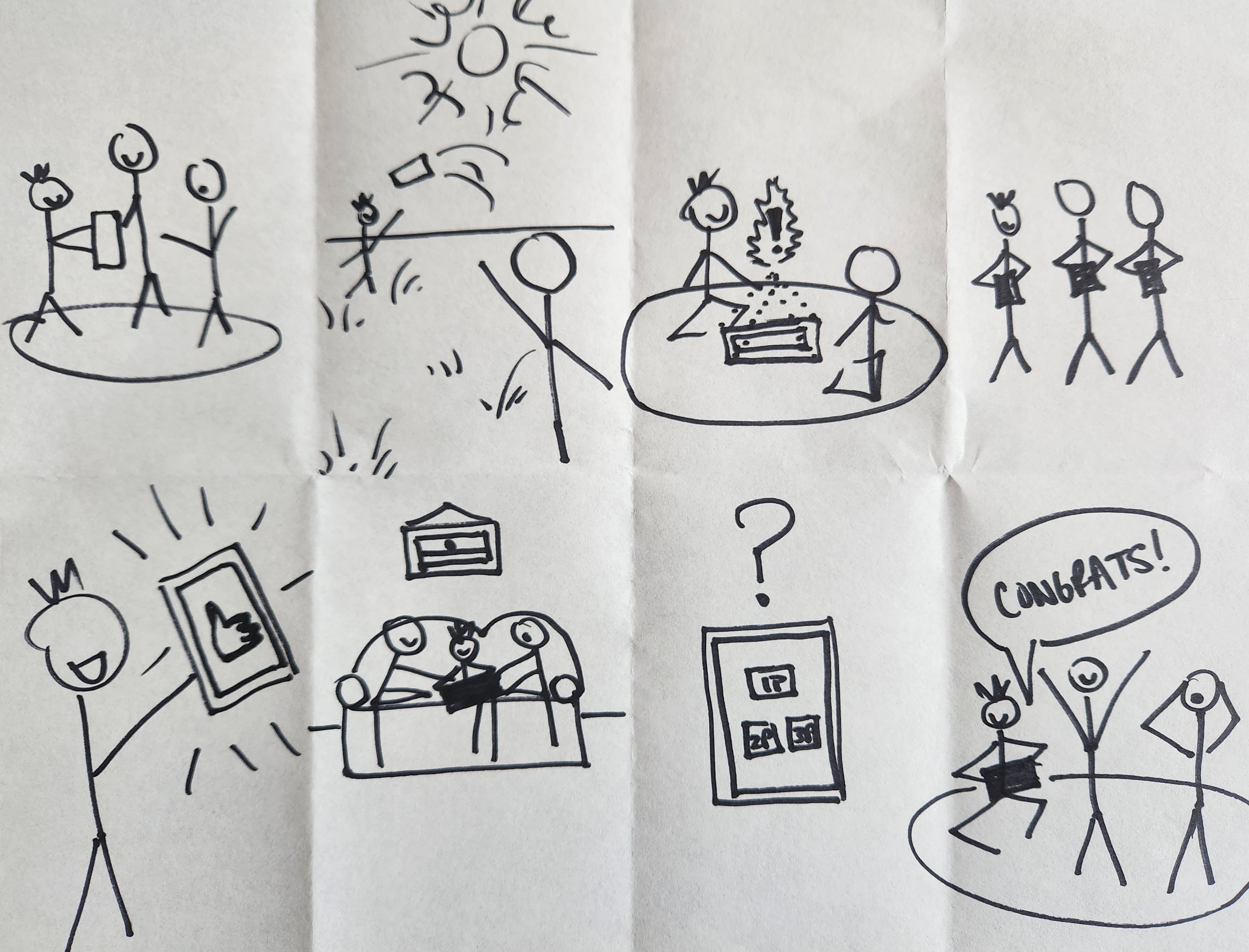
I began the ideation stage with rapid sketching of various solutions. I gave myself roughly one minute on each idea, thinking of a possible solution to the problem and putting it down on paper.
-
How Might We...
After gaining some perspective on the kind of app I would create, and how some of these problems could be resolved, I created a list of questions that would help me pinpoint the exact tools and features that would be most helpful in designing an app that meets the needs of the users.
the design process
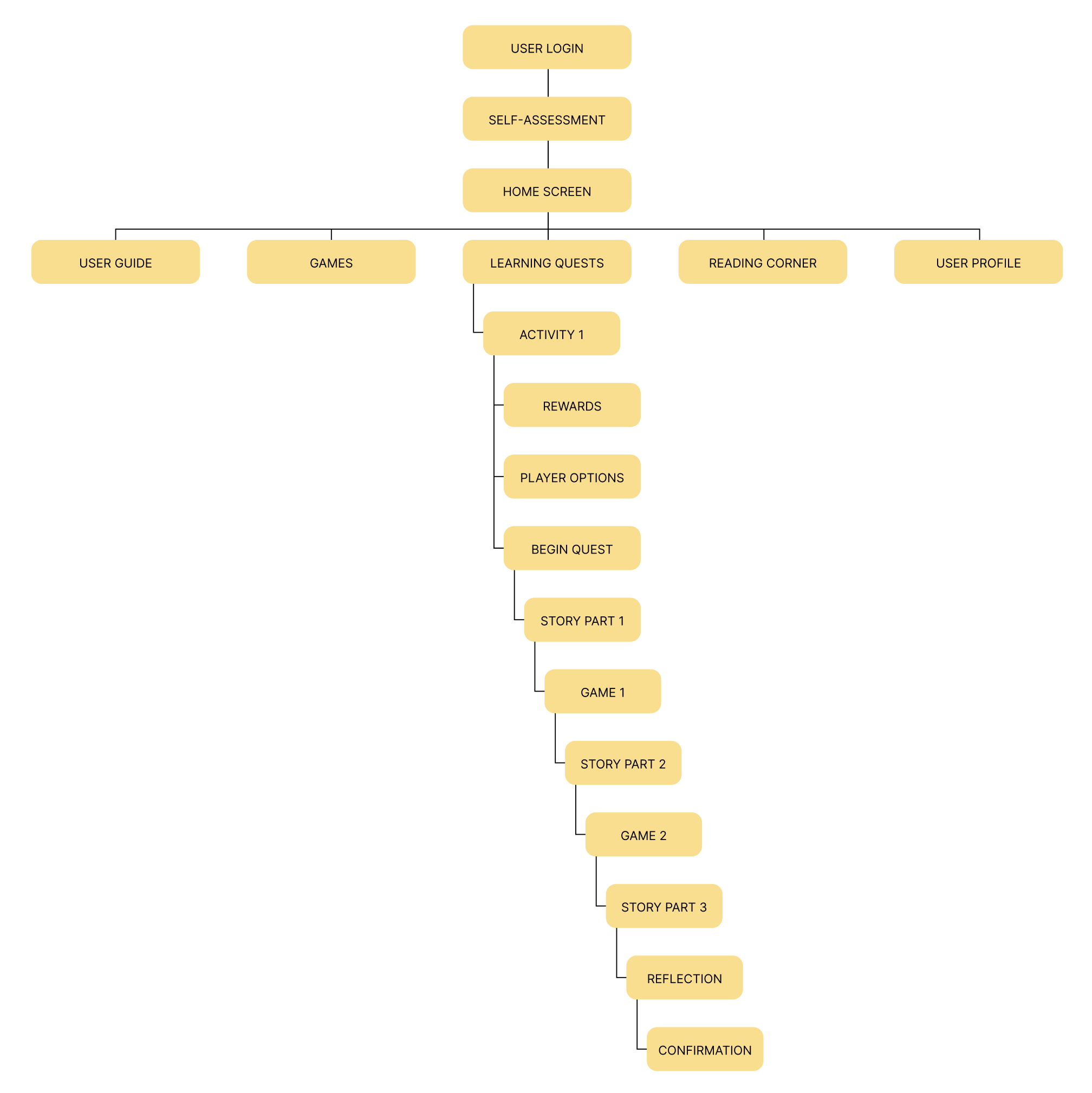
Upon completing the ideation phase of the project, I was able to better understand how the user should be able to interact with and move through the app to meet their needs. I created a Sitemap, paper and digital wireframes, and a low-fidelity prototype to initiate the app design. I then conducted a Usability Study to gain insights about the design, and made necessary changes to the prototype before designing the high-fidelity mockups and prototype.
sitemap
Low-Fidelity Wireframes & prototype
-
Paper Wireframes
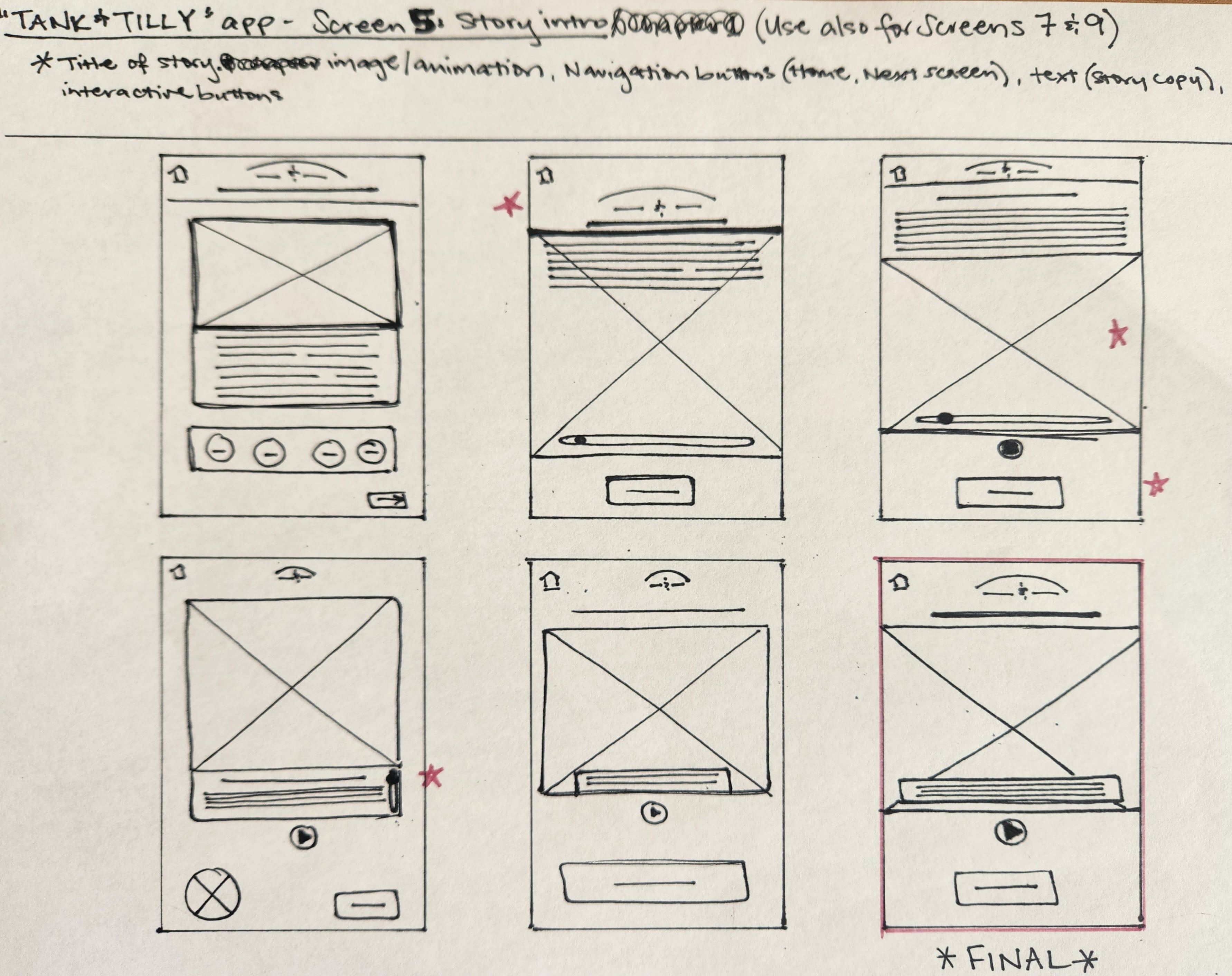
After setting up my information architecture, I started sketching paper wireframes for each screen of the app. I let the research guide my planning, keeping user pain points and insights in mind, and began with a list of important elements I wanted to include on the page.
The paper wireframe variations shown here focus on providing users quick access to any branch of the mobile app by organizing critical navigation items so they are easy to find.
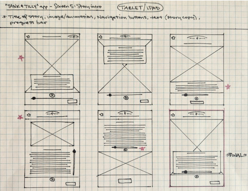
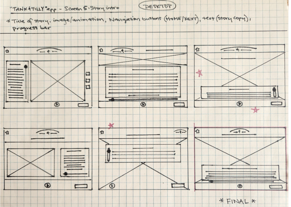
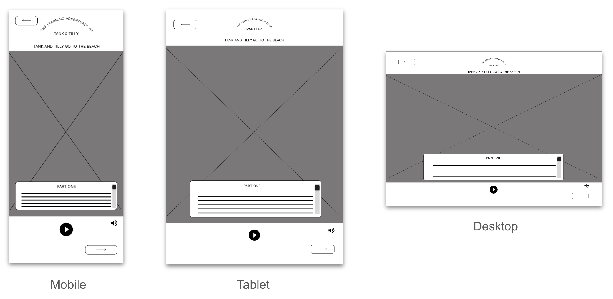
After creating paper wireframes for the mobile app, I started to work on designs for additional screen sizes. Users of the app should be able to utilize all of the app’s features on various devices, so I developed designs for a responsive website that users could access on a tablet or desktop computer.
-
Digital Wireframes
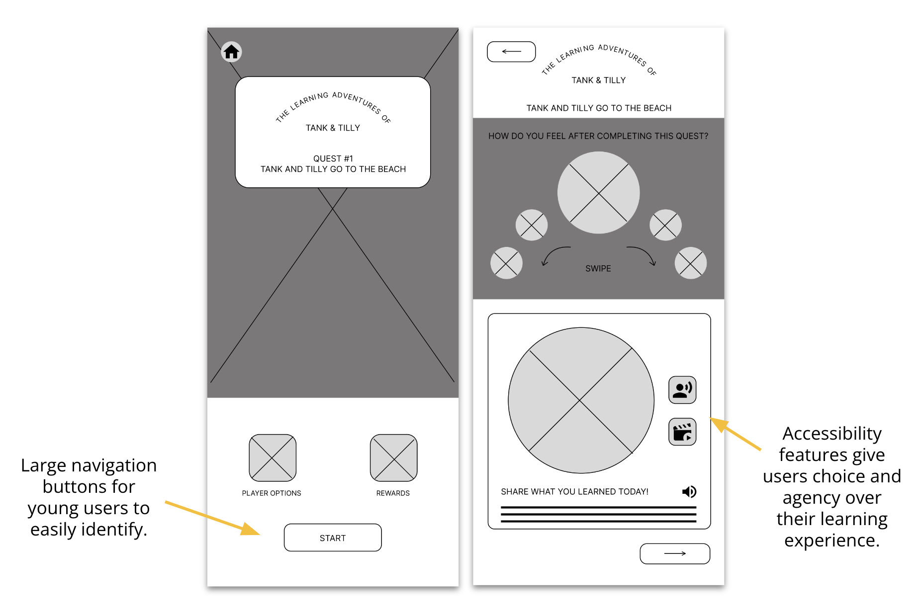
Using my paper wireframes as a guide, I created digital wireframes in Figma. It was exciting to finally be able to put all of my research and planning together and to see my designs coming to life. At this stage, I could already see how some of the choices I made would help ease user pain points.
-
Low-Fidelity Prototype
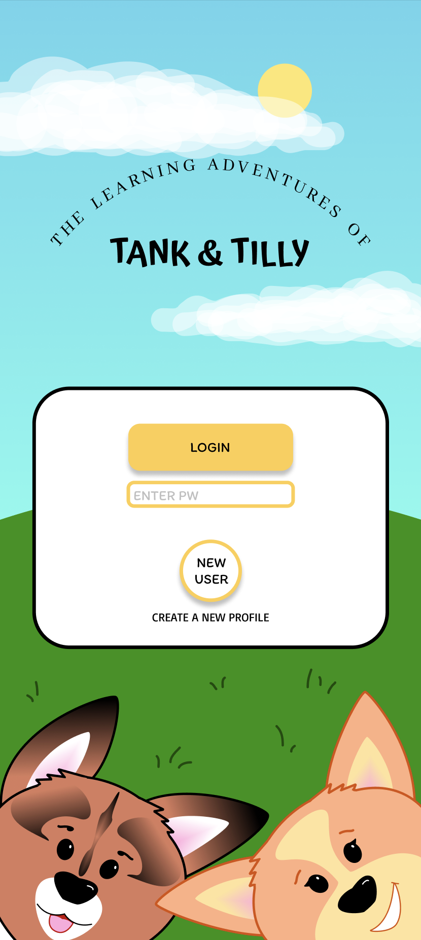
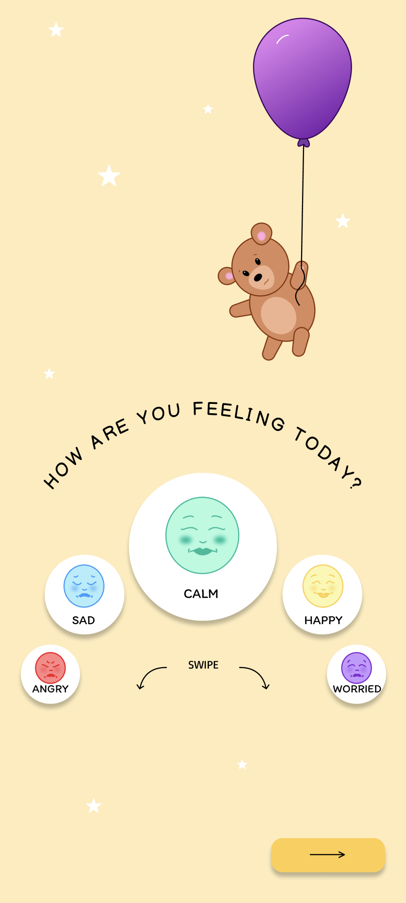
I created a low-fidelity prototype by connecting all of the screens involved in the main user flow of completing Learning Quest #1, and prepared my prototype for its first usability study. The user flow starts with a Login screen. Upon entering the app, the user is met with a Self-Assessment to bring awareness and attention to their current mood and/or emotions. Next, the user is brought to the Home screen, where they are prompted to begin Quest #1. This learning quest begins with an introduction screen, where the user has the option to choose the multiplayer version of the quest, and/or select their predetermined reward activity, made available once they have completed their task. Once the user is satisfied with their choices, they may start the learning quest. "Part One" opens the story of Tank, Tilly and Bear Bear, and their trip to the beach. The user reads along with the story, while the animation provides visual stimulation and keeps the user engaged. After Part One, the user is faced with a game to help them process what they've learned and apply their knowledge to advance to the next chapter in the story. The user moves through Part Two, followed by a second game, then Part Three, in the same fashion. After the user has successfully navigated these screens, they are prompted to reflect on the lessons they've learned, and the choices they had made throughout the quest. Upon completion of this task, the user is brought to the final screen where they are awarded a badge to signify their completion of Quest #1. The user may now choose to unlock their predetermined reward, or return to the Home screen to engage in other learning activities. LoFi Prototype:
Lo-Fi Prototype: Tank and Tilly app

usability study 1
-
Project Background
I am designing an accessible learning tool that will provide young users with a sense of agency while enabling them to learn about and manage their emotions and develop empathy for others. Current apps on the market are typically designed for a single user only, and lack the parental controls, notifications, and continuing education tools which would allow parents of young users to monitor and participate in their child’s learning. My app will allow users to engage in learning activities while cooperating and collaborating with others by using a multiplayer feature. Parents will be able to create their own linked account from which they can monitor, engage, and participate in their child’s learning.
-
Study Parameters and Methodology
Study Type: Unmoderated usability study
Location: United States, remote (each participant will complete the study in their own home)
Date: Sessions will take place during the week of April 28 - May 4 , 2024
Length: Each session will last approx. 10 minutes, with a SUS following the study
Compensation: None
-
Study Details
Research Goals:
I want to test the main user task of completing a learning quest to determine if participants find the app easy and enjoyable to use, and to identify challenges the user might face. Determine whether the app’s collaborative features are enough to attract and retain new users. Determine whether study participants find the Reflection activity at the end of the main user task useful.
Research Questions:
What can I learn from the user flow, or steps users take, to complete Quest #1?
Are there parts of the user flow where participants get stuck?
Are there parts of the user flow where participants get confused about next steps/navigation?
Are there design changes I can make to improve the user flow or overall user experience?
How many users find the app easy to use?
Do users find the reflection activity at the end of Quest #1 useful?
Participants:
Will have prior experience with other educational apps on the market
Are either parents/caretakers of young children, or have experience working with children in an educational setting
Are 2 males, 2 females and 1 non-binary individual, aged 18-65 years old
At least one participant to use assistive technologies (screen reader, closed captions)
Key Performance Indicators:
System Usability Scale
User error rates
Conversion rates
Study Plan:
UX Research Study Plan- Tank & Tilly (lofi) -
Findings
These were the main findings from Usability Study 1, which would be turned into insights for the next steps of the design:
Progress bar feels out of place: Users felt the progress bar on the "story" screens would be better placed beneath the text. Task feels too repetitive (1): Users want more diversity in the mini-learning games to retain user interest and engagement. Task feels too repetitive (2): Users found the second self-assessment activity on the Reflection screen unnecessary.
iterations made to lofi designs
-
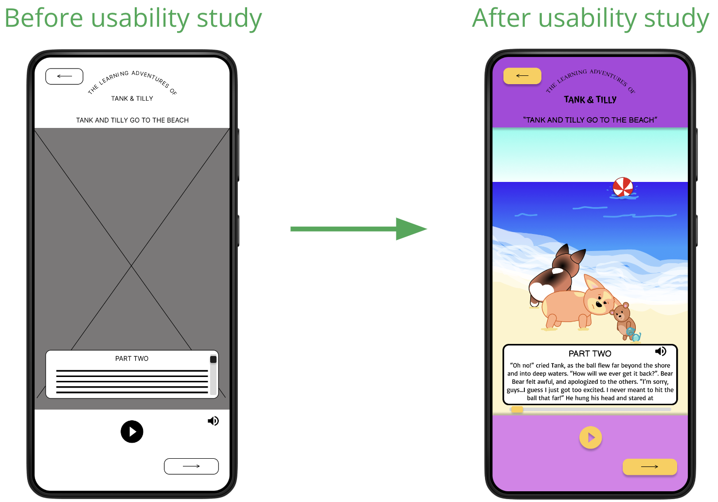
Insight 1
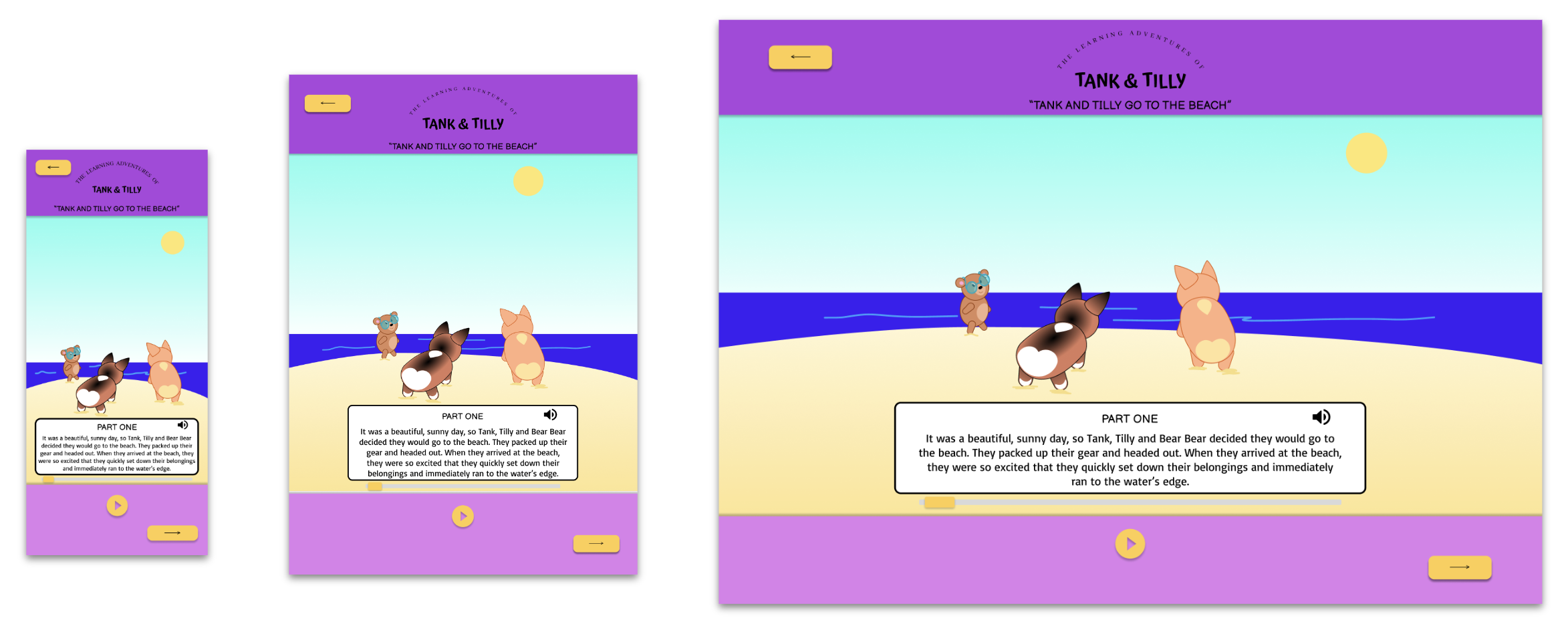
One of the study participants mentioned that they would have liked to see the story "progress bar" placed beneath the story text, rather than to the right of it. In making this change, I realized this may help young users better keep track of their place in the story, as well as provide them an easier slide to interact with when they want to advance or rewind the video clip and text. I also changed the placement of the audio on/off feature to share the same space as the story text, in an effort to make this feature more visible to my young audience.
-
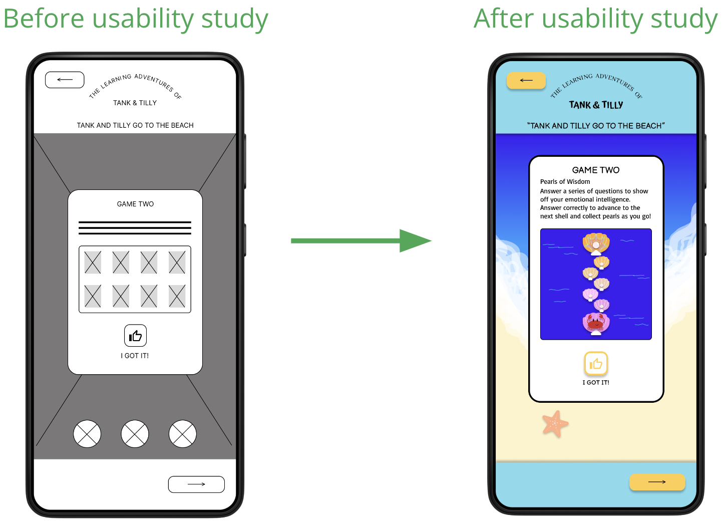
Insight 2
The second insight I received from the study was that participants were not fond of the repetition of the game activity, and would have liked to see two different games instead. I agreed, whole-heartedly, and changed the second game to maintain user interest and engagement.
-
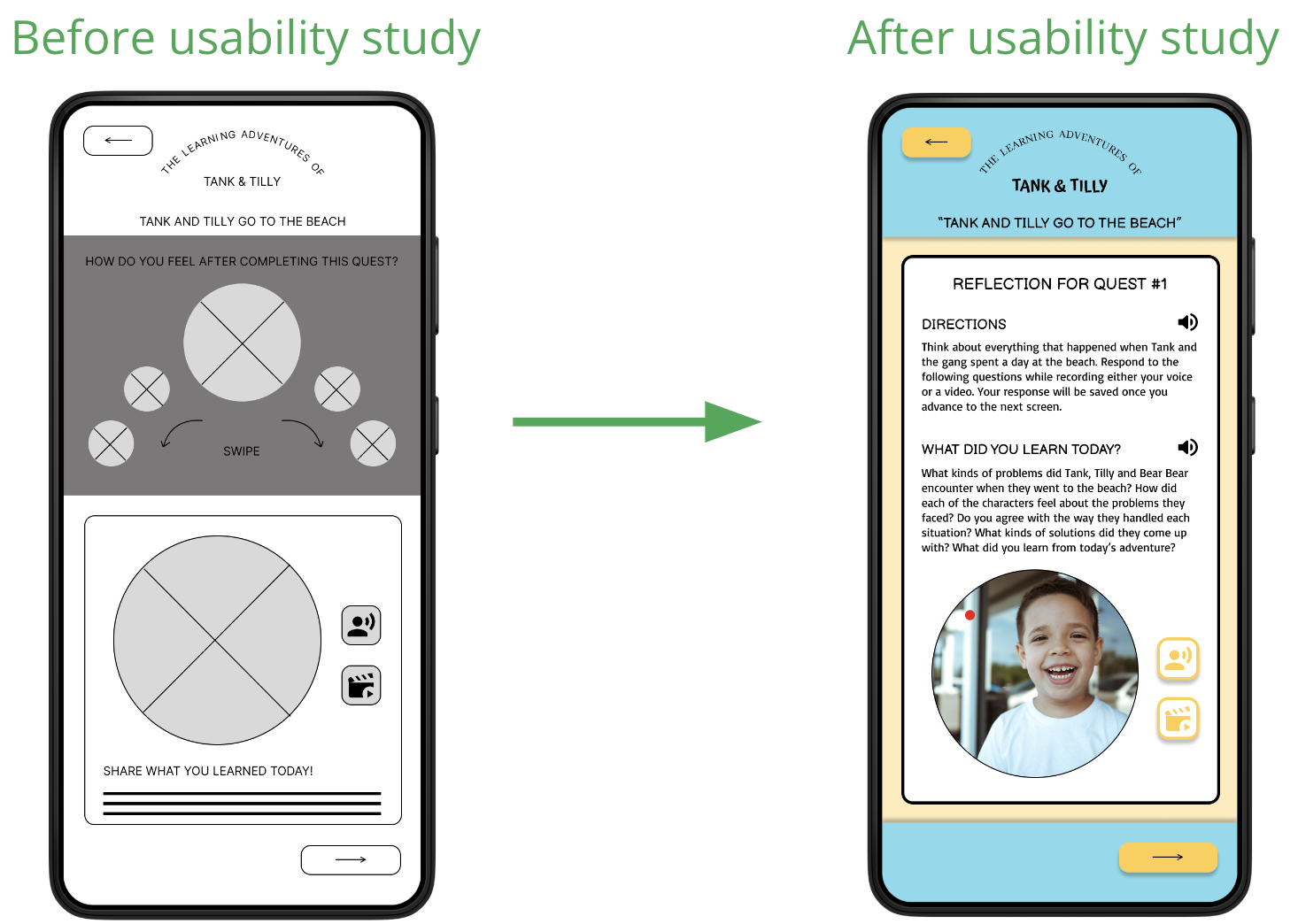
Insight 3
Study participants agreed that the self-assessment piece on the Reflection screen was unnecessary and frustrating, since users are already prompted to complete this activity upon logging in to the app. I took their advice and removed this second self-assessment, which in turn left more room for thoughtful reflection prompts critical in determining the user's learning outcomes.
high-fidelity mockups and prototypes
-
Mockups
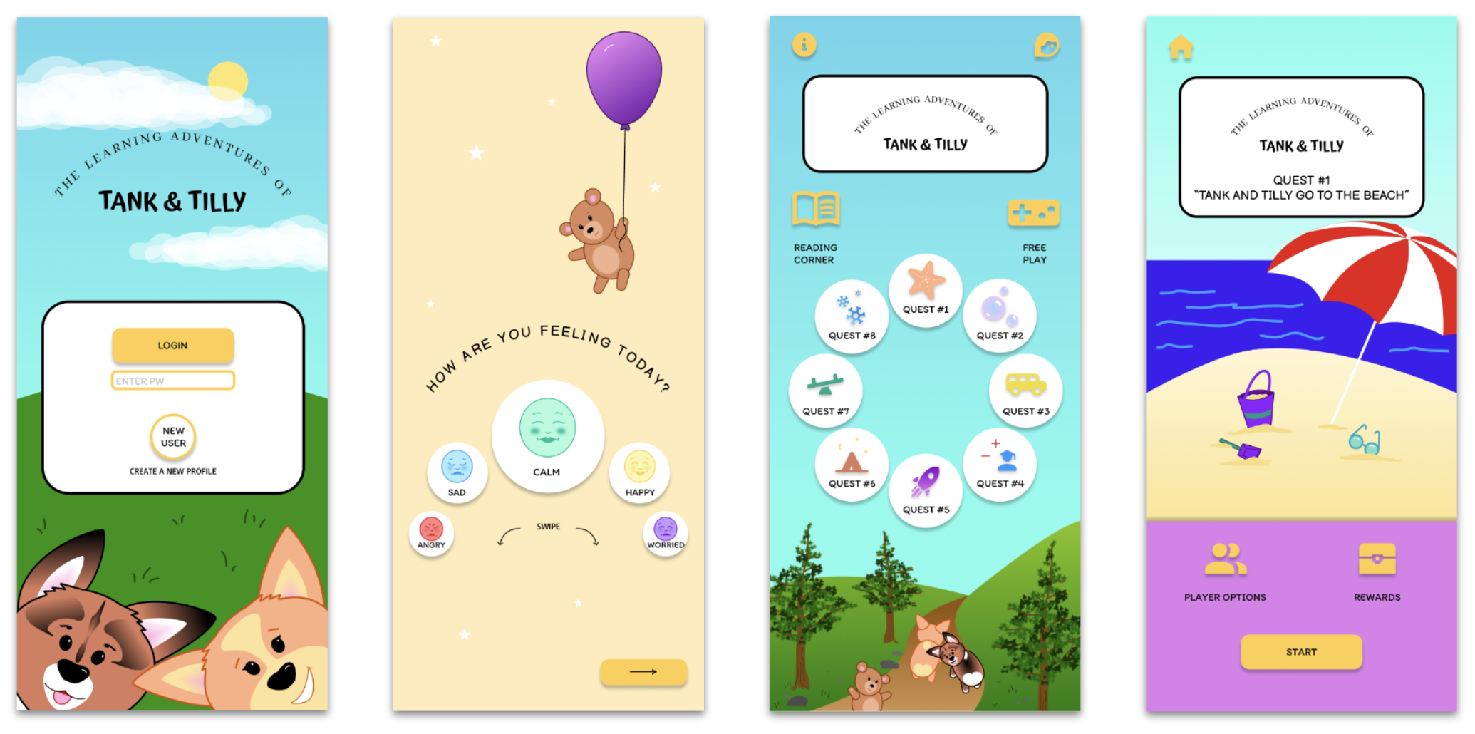
I included considerations for additional screen sizes in my mockups based on my mobile app designs. Since users may create and communicate from a variety of devices, I felt it was important to include both a tablet and desktop version to give users choice and agency over their experience.
-
High-Fidelity Prototype
After making some minor adjustments to the screen layouts and in-quest activities, I created a high-fidelity prototype of the main user task. The design features bold, saturated colors attractive to young users, a storyline that stars friendly and relatable cartoon characters to keep user's focus and build empathy, interactive prompts to maintain user's interest and engagement, and reflection activities to help young users process as well as display what they've learned through completing this task.
HiFi Prototype:
The Learning Adventures of Tank & Tilly app (HiFi prototype)

usability study 2
-
Project Background
I am designing an accessible learning tool that will provide young users with a sense of agency while enabling them to learn about and manage their emotions and develop empathy for others. Current apps on the market are typically designed for a single user only, and lack the parental controls, notifications, and continuing education tools which would allow parents of young users to monitor and participate in their child’s learning. My app will allow users to engage in learning activities while cooperating and collaborating with others by using a multiplayer feature. Parents will be able to create their own linked account from which they can monitor, engage, and participate in their child’s learning.
-
Study Parameters and Methodology
Study Type: Unmoderated usability study
Location: United States, remote (each participant will complete the study in their own home)
Date: Sessions will take place during the week of June 29-July 6, 2024
Length: Each session will last approx. 10 minutes, with a SUS following the study
Compensation: None
-
Study Details
Research Goals:
I want to test the main user task of completing a learning quest to determine if participants find the app easy and enjoyable to use, and to identify challenges the user might face. Determine whether the app’s collaborative features might attract and retain new users. Determine whether study participants find the Reflection activity at the end of the main user task useful.
Research Questions:
What can I learn from the user flow, or steps users take, to complete Quest #1?
Are there parts of the user flow where participants get stuck?
Are there parts of the user flow where participants get confused about next steps/navigation?
Are there design changes I can make to improve the user flow or overall user experience?
How many users find the app easy to use?
Do users find the reflection activity at the end of Quest #1 useful?
Participants:
Will have prior experience with other educational apps on the market
Are either parents/caretakers of young children, or have experience working with children in an educational setting
Are 2 males, 2 females and 1 non-binary individual, aged 18-65 years old
At least one participant to use assistive technologies (screen reader, closed captions)
Key Performance Indicators:
System Usability Scale
User error rates
Conversion rates
Study Plan:
UX Research Study Plan- Tank & Tilly (hifi) -
Findings
These were the main findings from Usability Study 2, which would be turned into insights for the next steps of the design:
Change sun color:
Users commented that the color of the sun image looks identical to the call-to-action buttons and may cause confusion for young users. Animate interactive buttons: One user suggested adding animations to the Self-Assessment screen and Home screen (so emojis and Quest buttons pop up/enlarge when the user drags over them) may be helpful when users are making their selection.
accessibility considerations
-
1
Audio on/off feature included in all parts of the story, as well as in the Reflection piece. Voice-enabled feature will allow user to address prompts/questions throughout the app using their voice (limits touch).
-
2
Option for user to record audio only, or video, on Reflection screen. Recording will be sent to parent for review. Parent will receive a notification (haptics) via the app.
-
3
High contrast colors used to make call to action items easy to identify. The use of clear visual hierarchy and simple fonts make the experience easier for young users who are still learning to read.
going forward
Testing the hifi prototype with users, both in and outside of the target user group, will inform the next stages of this project.
takeaways
-
Impact:
Study participants agree that the app is easy to use, engaging, and would be a useful tool in educating young learners about emotions and empathy. -
What I learned:
Along with the insights gained from running the second usability study, there are many features that I feel would benefit users that I want to include as I build the app out further. I am excited to see where this project will go, and how it can be improved to meet the needs of its target users, and how parents, teachers and guardians can benefit from its use as well.
next steps
1
Change “player options” button to a single player/multiplayer switch for the user to engage before starting their quest. When engaged, the multiplayer switch clearly indicates to users that they will be collaborating with others to complete the activities in the quest.
2
Include interactive screens throughout the story in which the user is tasked to select the best course of action for the characters to take based on their emotions and problem-solving. This will help to keep users engaged in the plot while also giving them agency over their actions and decision making.
3
Develop screens for the parent account to showcase unique features available to parents of children using the app. Parents will be able to connect with their child by opting to receive notifications when their child has completed a learning activity, and will be able to review their child’s Reflection to quickly and easily understand what their child learned about. Parents can also opt to receive useful communication tools to help them engage in conversation with their child about their learning to help the child process and apply what they’ve learned to real life situations.