music production
Co-vibe studio
Website and Mobile App
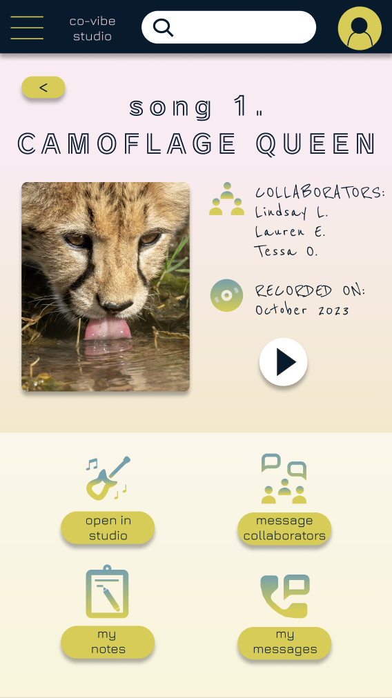
Co-Vibe Studio is a music-sharing website and mobile app that allows users to efficiently collaborate on and share music projects with others around the globe. The typical user is 18-65 years old and either creates music as a hobby, or as part of their profession. Co-Vibe Studio aims to provide an engaging product that celebrates personal expression, collaboration and creativity among its users.
Project Duration: October - December 2023
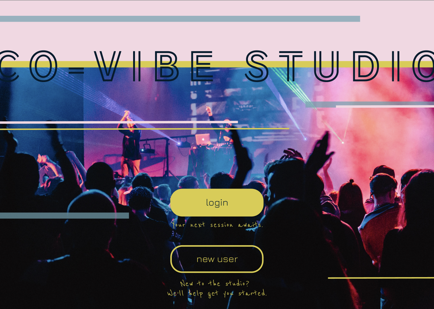
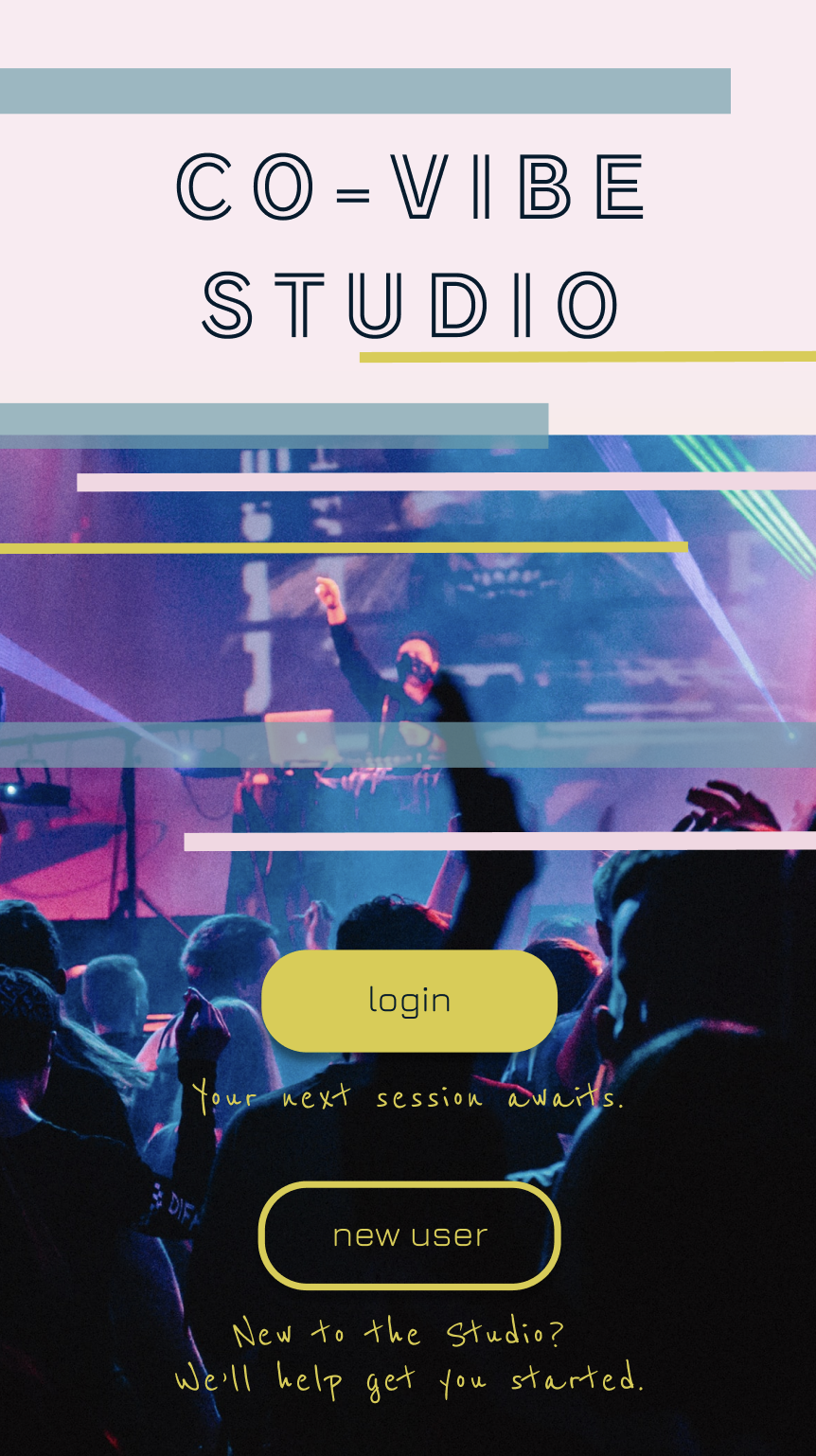
project overview
My Roles: UX research, UX/UI design (LEAD)
Responsibilities: Conduct user research and interviews, competitive audits, prepare user personas and user journey maps, create a sitemap and paper and digital wireframes, low-fidelity prototyping, high-fidelity mockups and prototyping, conduct usability studies, account for accessibility, iterate on designs and responsive design.
Tool: Figma
-
The Problem
Available music-sharing apps are not conducive to remote artistic collaboration. Users want to be able to clearly and effectively communicate their ideas while working on shared-music projects - regardless of their location, or physical or language abilities.
-
The Solution
Design a music-sharing app that will make communication and collaboration accessible for all users and their distinct abilities. Effectiveness of the app will be measured by tracking those who are using the communication features provided.
understanding the user
In order to ensure my design would meet the specific needs of the user, I conducted research and organized my findings to identify common pain points so that I could create a user persona to represent the target user group.
user research
-
Summary
In order to understand the target user and their needs, I conducted user interviews and constructed empathy maps. Through my findings, I was able to identify clear user pain points which I used to build user personas to represent my target audience. I discovered that many users enjoy being able to collaborate while creating music online. However, while most music-sharing apps promote the idea of sharing music with others, they they appear to lack essential features and tools that would actually help users create music in a collaborative way. I also learned of user’s frustrations with not being able to keep their ideas and written exchanges organized in one convenient place. Additionally, some users enjoy being able to create music remotely and wish to collaborate with others from around the world, but worry their language skills may act as a barrier to the clear exchange of ideas with their collaborator.
-
Pain Points
Collaboration: Current music-sharing apps lack essential communication tools and features, making it difficult for users to work with others remotely.
Accessibility: Lack of language support and customization in current music-sharing apps deters users from collaborating with others.
Organization: No current space for musicians to collect and organize their ideas, recordings, and communications/exchanges with their collaborators. Relying on multiple apps is inconvenient and makes it difficult to keep everything organized.
Experience: Music-sharing apps can be difficult to learn and navigate, resulting in a negative user experience.
-
User Personas
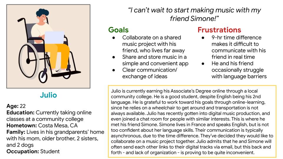
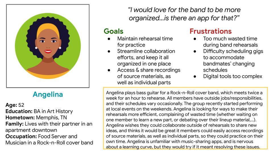
I created two fictional personas to represent my user groups. I referred to the persona of "Julio" throughout my design process to make sure I created user-centered designs.
Problem Statement: Julio is an aspiring musician and English-Learner who needs a convenient way to share his recordings and notes because he wants to collaborate with his friend, who lives in a faraway country.
-
User Journey Maps
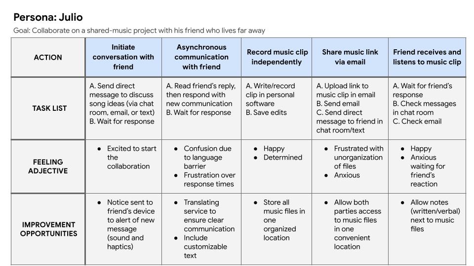
I created a user journey map of Julio’s experience communicating and collaborating with his friend who lives in another country and whose native language is different than his own.
-
Competitive Audits
I conducted a competitive audit, which allowed me to learn about the successes and shortcomings of other similar products already on the market. I also read user reviews to learn what people enjoy most about these products, as well as their frustrations.
I compared direct and indirect competitors based on their general information, first impressions and overall UX, including features and interaction, visual design and content.
initial concepts
I reflected on my findings from the competitive audit and related them back to my user goals to come up with many different solutions to the problems I was trying to solve. I began generating ideas through creative exercises, so that I was sure to think outside the box for solutions that may not be readily apparent.
ideation
-
Storyboarding
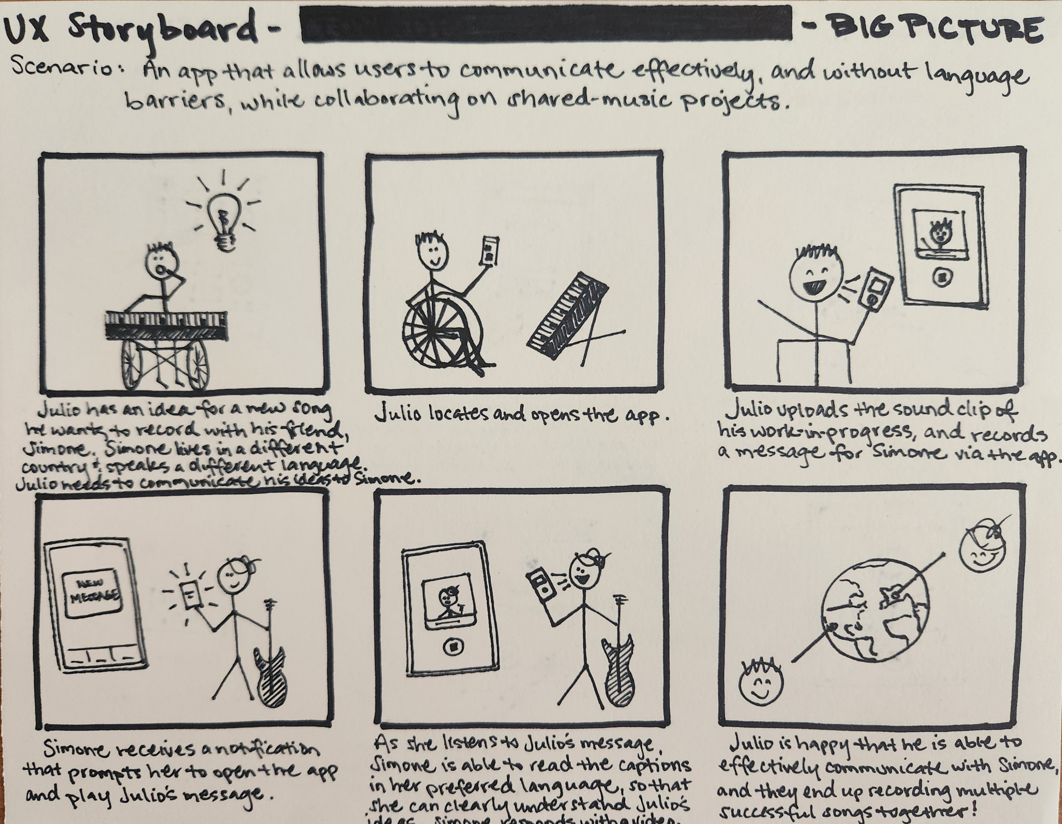
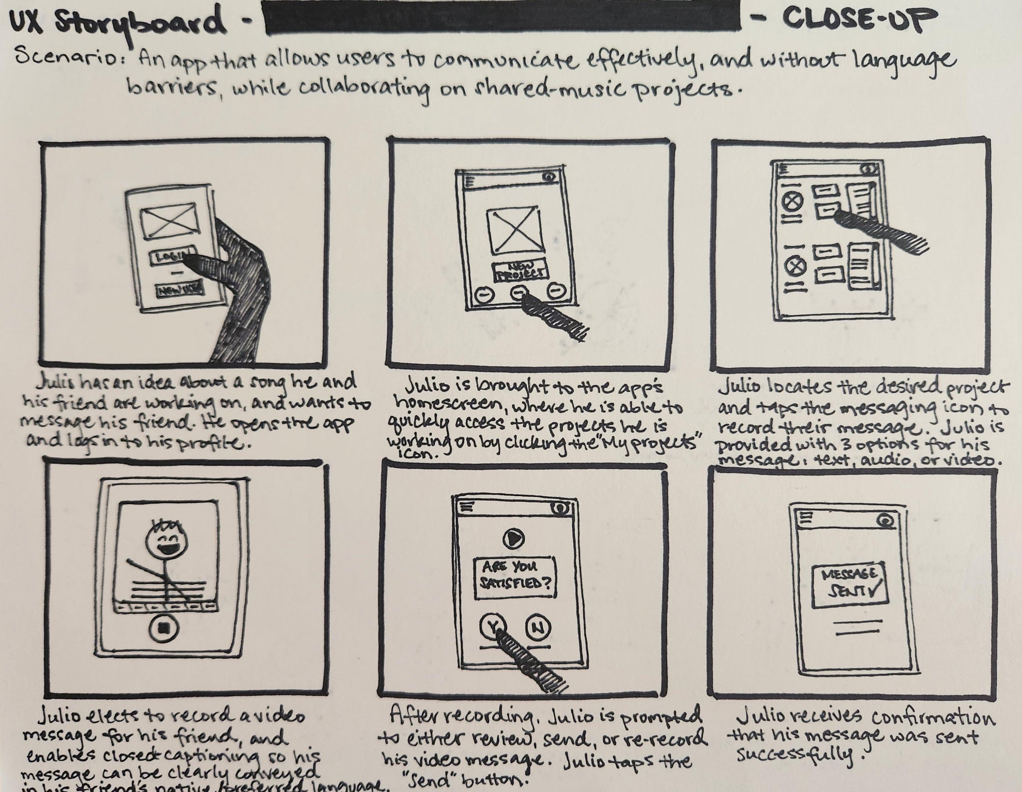
I created a Big Picture storyboard using my user persona, Julio, as the subject. I considered Julio's user journey, needs and concerns as I imagined how this new app could make a positive impact in his day to day activities. I then created a Close-Up storyboard to envision the user flow (how the user will interact with and move though) the app.
Big Picture Close Up
the design process
Upon completing the ideation phase of the project, I was able to better understand how the user should be able to interact with and move through the app to meet their needs. I created a Sitemap, paper and digital wireframes, and a low-fidelity prototype to initiate the app design. I then conducted a Usability Study to gain insights about the design, and made necessary changes to the prototype before designing the high-fidelity mockups and prototype.
sitemap
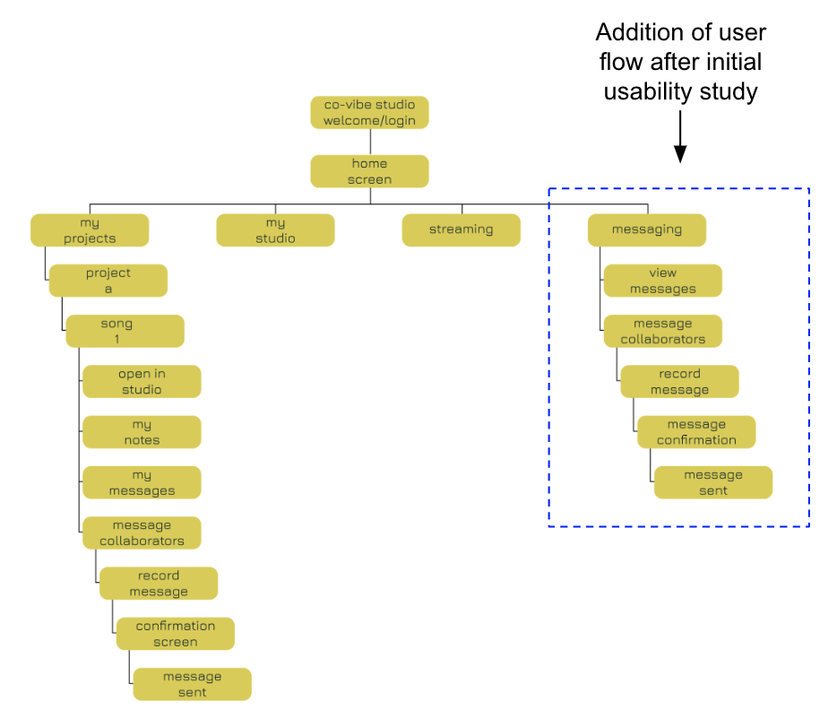
I initially created a sitemap with the idea that users would first navigate to one of their music projects in order send a message to one of their collaborators. As a result of insights collected from a usability study, I have included a second user flow that allows users to connect to the messaging features from the Home Screen, directly.
My goal here was to use an information architecture structure that would improve user navigation and overall experience with the app.
Low-Fidelity Wireframes & prototype
-
Paper Wireframes
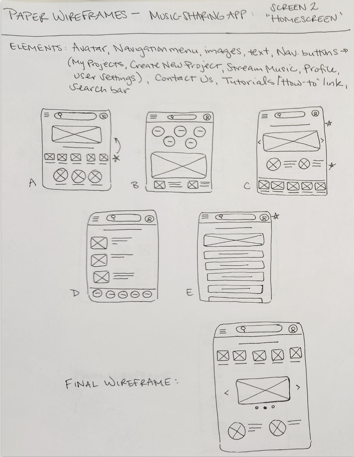
After setting up my information architecture, I started sketching paper wireframes for each screen of the app. I let the research guide my planning, keeping user pain points and insights in mind, and began with a list of important elements I wanted to include on the page.
The Home Screen paper wireframe variations shown here focus on providing users quick access to any branch of the mobile app by organizing critical navigation items so they are easy to find.
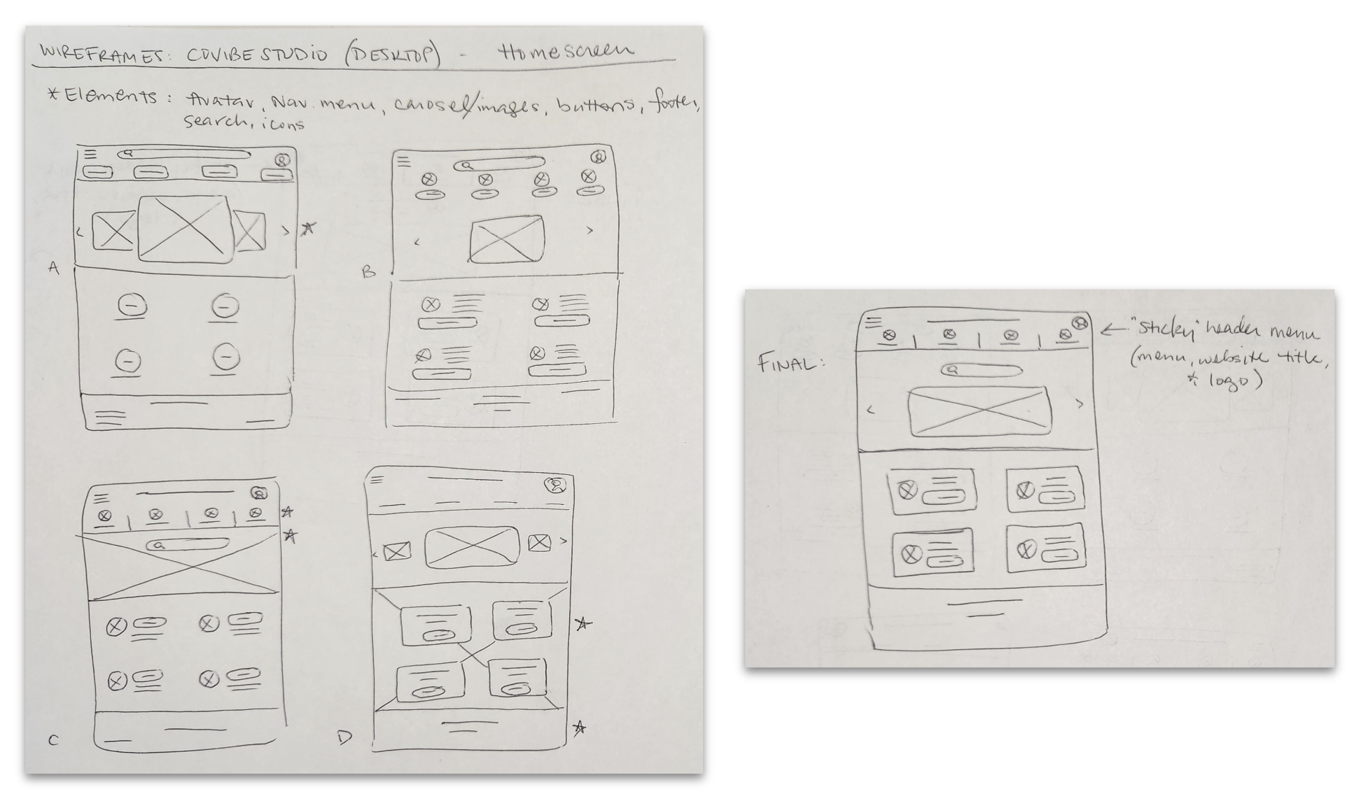
After creating paper wireframes for the mobile app, I started to work on designs for additional screen sizes. Users of the app should be able to utilize all of the app’s features on various devices, so I developed designs for a responsive website that users could access on a desktop computer.
-
Digital Wireframes
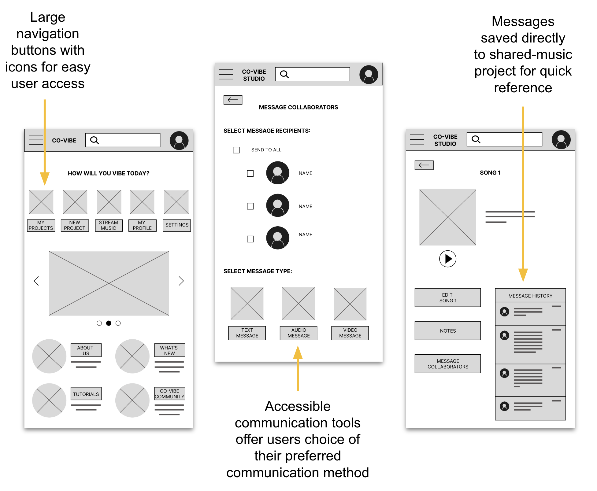
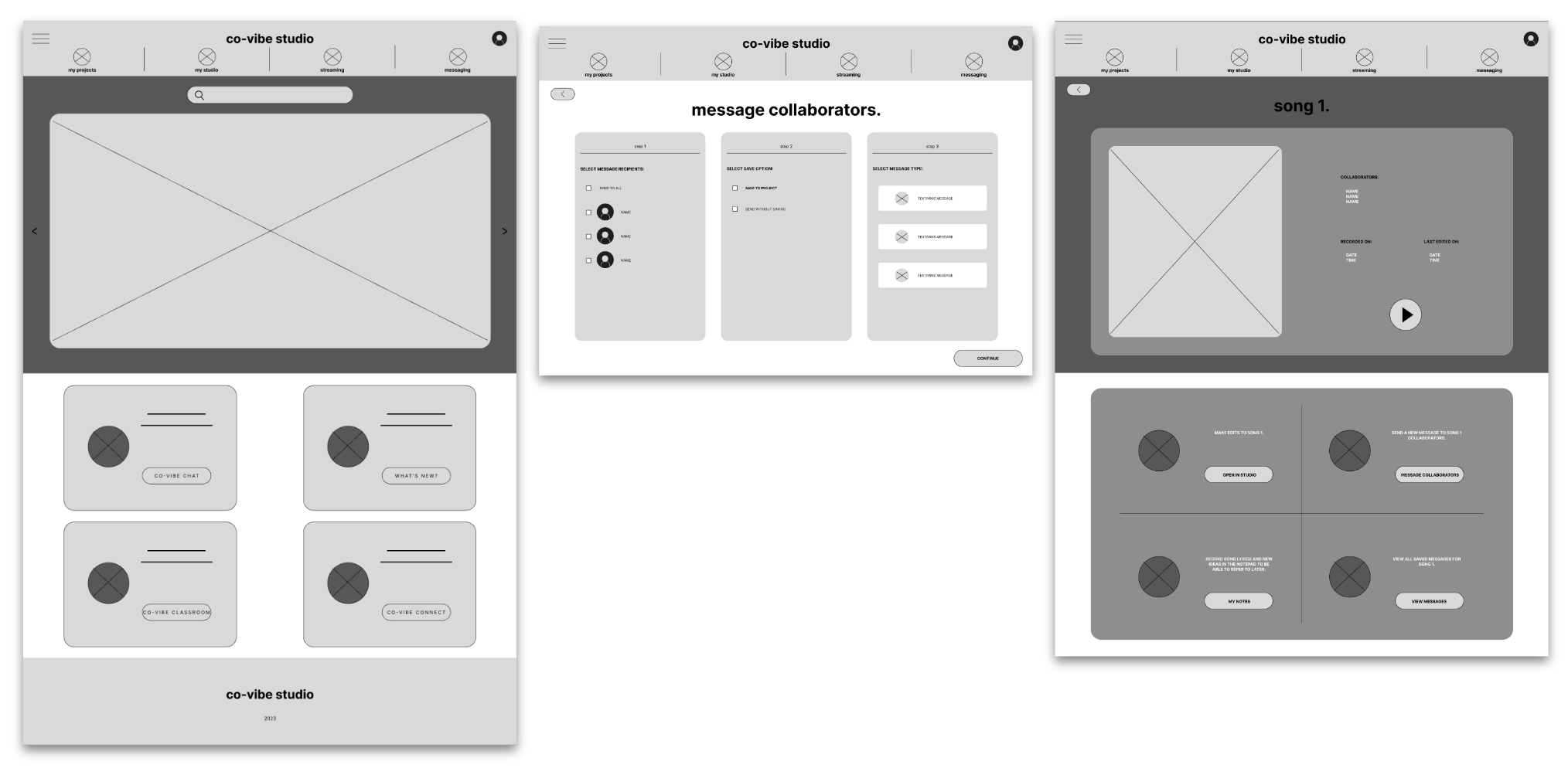
Using my paper wireframes as a guide, I created digital wireframes in Figma. It was exciting to finally be able to put all of my research and planning together and to see my designs coming to life. At this stage, I could already see how some of the choices I made would help ease user pain points.
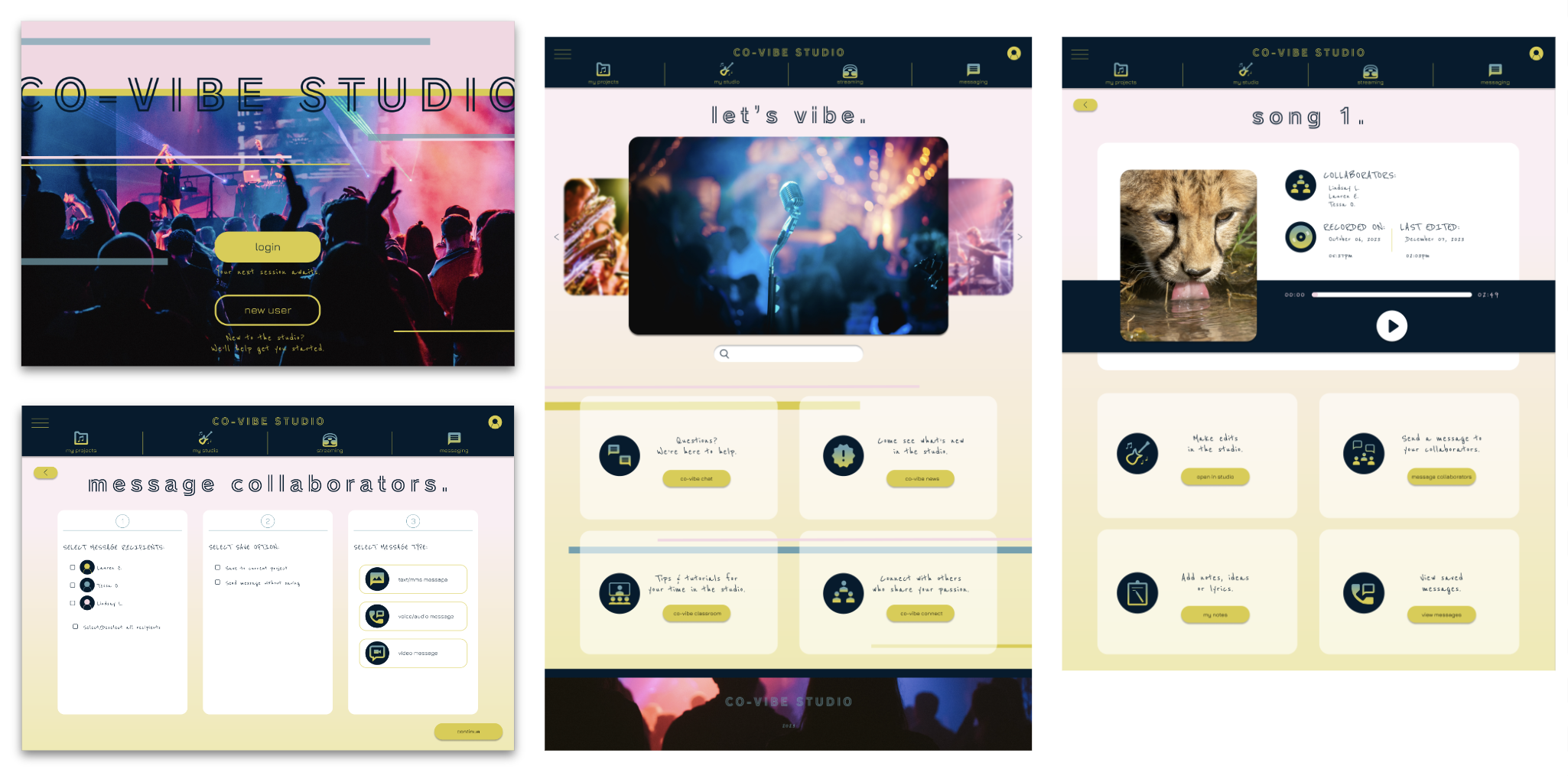
In order to maintain a fully-responsive website, I implemented the same components and ideas into the desktop version of the screens. My original designs needed to be adjusted to fit the new screen size. One major change was that with more real estate on the page, critical navigation buttons could now be viewed and quickly accessed throughout the user flow, rather than being hidden from view in a collapsed menu.
-
Low-Fidelity Prototype 1
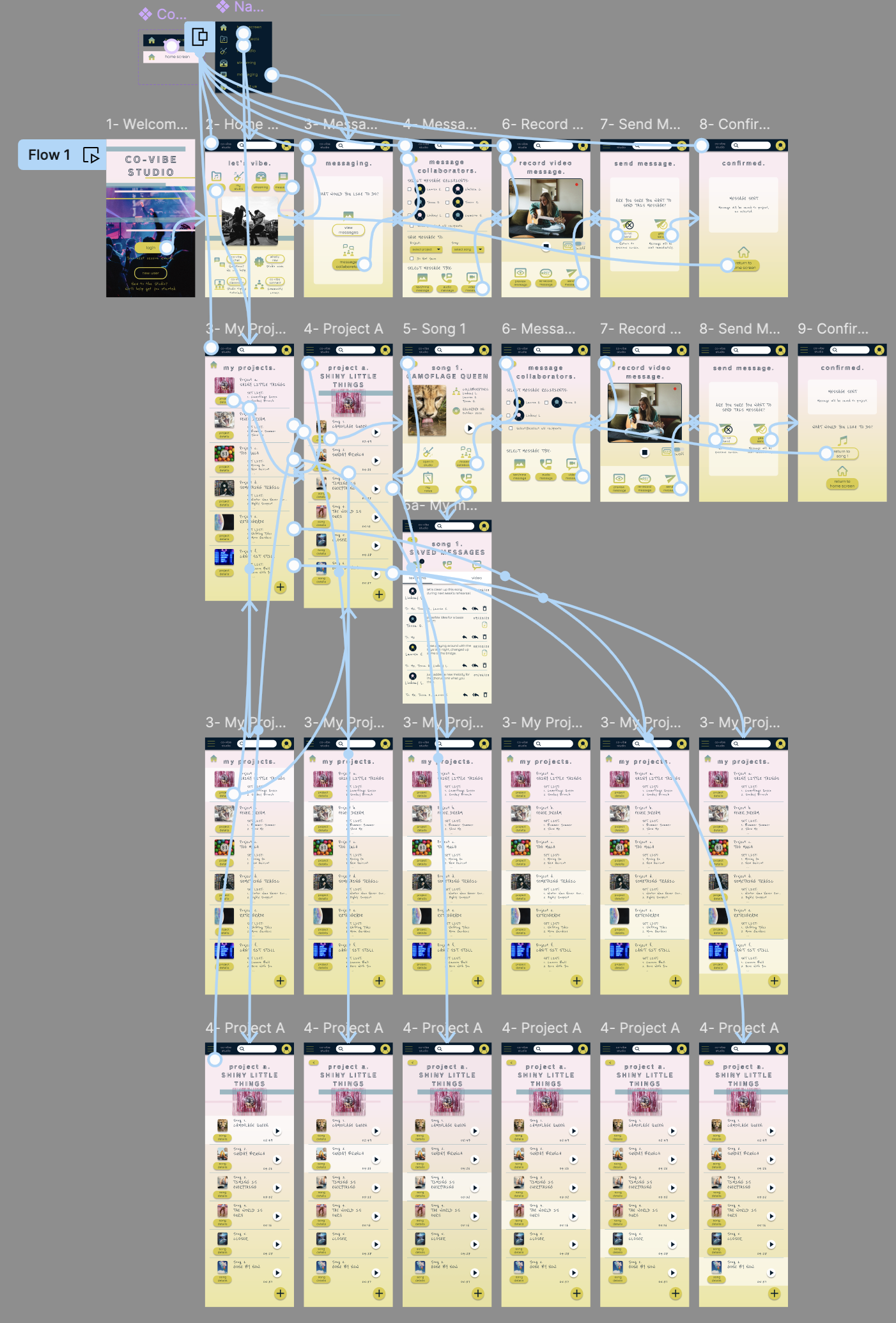
I created a low-fidelity prototype by connecting all of the screens involved in the main user flow of sending a video-message to a fellow music collaborator. The user flow begins with a Login screen, where the user is prompted to either login or create a new user profile. Upon logging in to the app, the user is met with a Home screen, where they can view their saved projects by tapping the "My Projects" button. When the user selects a project from the list, they are provided another list of songs within that project. The user can then select a song, where they are given access to the details of the song as well as options for making edits and messaging their song collaborators. The user selects the "Message Collaborators" option, then chooses which of their collaborators they would like to communicate with, as well as the method of communication. The user clicks on "Video Message", where they are taken to a screen where they can record a message using video and audio features. From there, the user can elect to "Send Message", and is greeted with a confirmation screen that asks whether they are sure they want to send their message. When the user confirms submission, they are presented with a final screen to notify them that their message has been sent. I had received feedback from my peers about page layout and navigational cues that would better assist the user in completing their task. I implemented these suggestions, and readied my prototype for its first usability study.
LoFi Prototype: Co-Vibe Studio - LoFi Prototype v.1 (mobile)

usability study
-
Project Background
Co-Vibe Studio is a music-sharing app that will help users effectively communicate with anyone they want to create, and/or share, their music with. I need to find out if the main user task, sending a video message to a project collaborator, is enjoyable and easy to complete, and whether users find this communication feature useful.
-
Study Parameters and Methodology
Study Type: Unmoderated usability study
Location: United States, remote (each participant will complete the study in their own home)
Date: Sessions will take place during the week of August 27-September 3, 2023
Length: Each session will last approx. 10 minutes, with a SUS following the study
Compensation: None
-
Study Details
Research Goals:
Identify challenges the user might face when using communication features on the app to complete specific tasks, such as sending a text, audio and/or video message to one of their collaborators. Determine whether the app’s collaborative features are enough to attract and retain new users.
Research Questions:
What can I learn from the user flow, or steps users take, to send a message (video) to one of their song collaborators?
Are there parts of the user flow where participants get stuck?
Are there parts of the user flow where participants get confused about next steps/navigation?
Are there design changes I can make to improve the user flow or overall user experience?
How many users find the app easy to use?
Do users find the communication features in the app useful?
Participants:
Will have prior experience with other music-sharing apps on the market
Are 2 males, 2 females and 1 non-binary individual, aged 18-65 years old
At least one participant to use assistive technologies (screen reader, closed captions)
Key Performance Indicators:
System Usability Scale
User error rates
Conversion rates
Usability Study Plan:
UX Research Study Plan- Co-Vibe Studio App -
Findings
These were the main findings from Usability Study 1, which will serve as insights for the next steps of the design:
Easy to use, could be easier: Users found the app easy to use because of the design layout and clearly defined action items. One user wanted an indicator that they could scroll down the “My Projects” page.
Too many steps: Users need a faster way to access the app’s communication features. Users want to be able to access these features from the Home Screen.
Confusion over Inspiration Board: Users were unable to see the value of the ‘Inspiration Board’ on the Project screen, and felt it was unnecessary.
iterations made to lofi designs
-
Insight 1
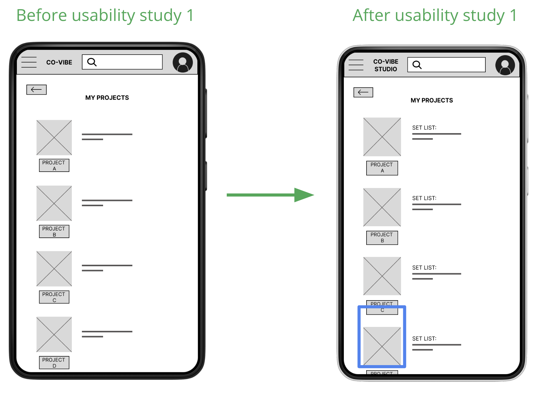
The first usability study provided insights on the layout of certain screens, such as the “My Projects” screen seen here. Users commented they wanted some indication of the page’s ability to scroll down in order to view more projects. I updated the layout of this screen to make it obvious to viewers that there is more content on the page than what they are initially shown. Users can now quickly understand that they are able to scroll down the list of projects to view more.
-
Insight 2
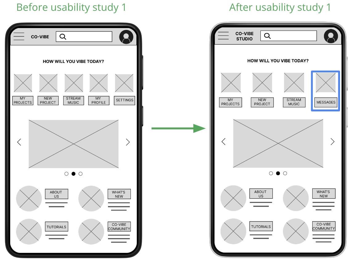
Usability Study 1 revealed frustrations from users who felt there were too many screens to navigate in order to complete the main user task. Users wanted quick access to communication tools from the Home Screen. Based on these insights, I updated the design to feature a button that will give users direct access to communication features from the Home Screen. I also made it easier for users to select desired features by eliminating non-essential buttons and creating more white space.
-
Low-Fidelity Prototype 2
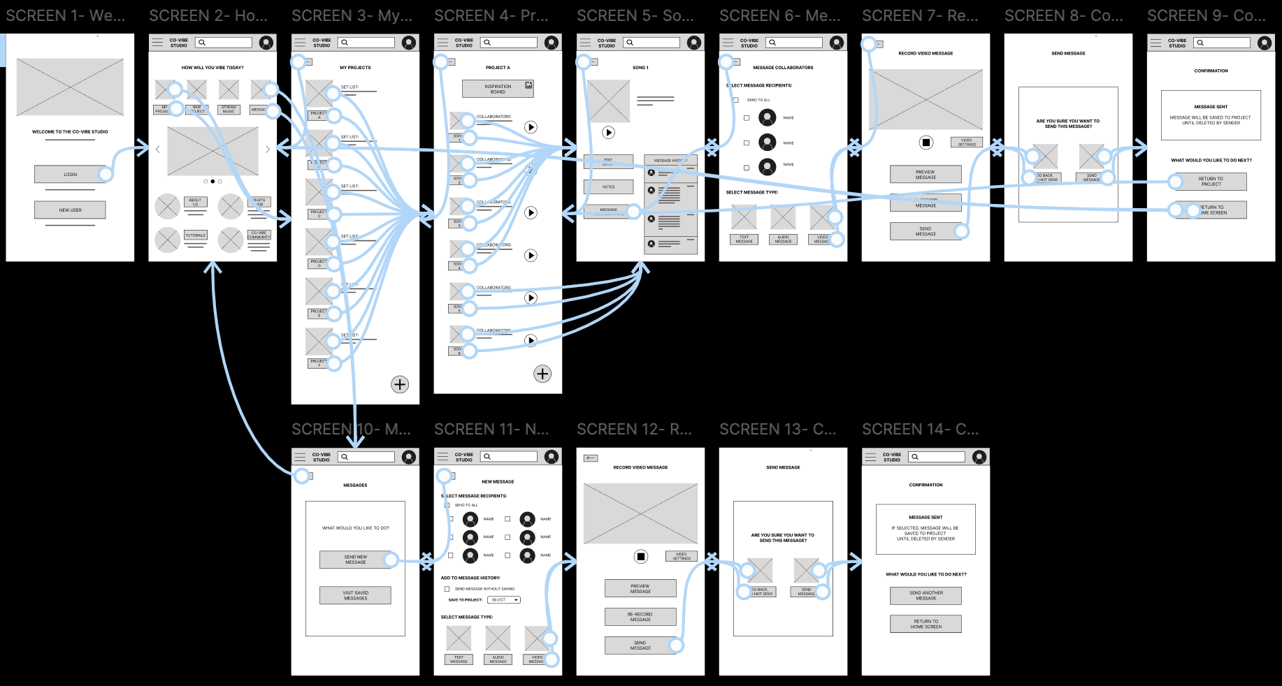
After running Usability Study 1, I learned that most participants would have liked a more streamlined approach to completing the main user task. I took their observations into consideration, and created a button on the Home screen that would give users direct access to the messaging features.
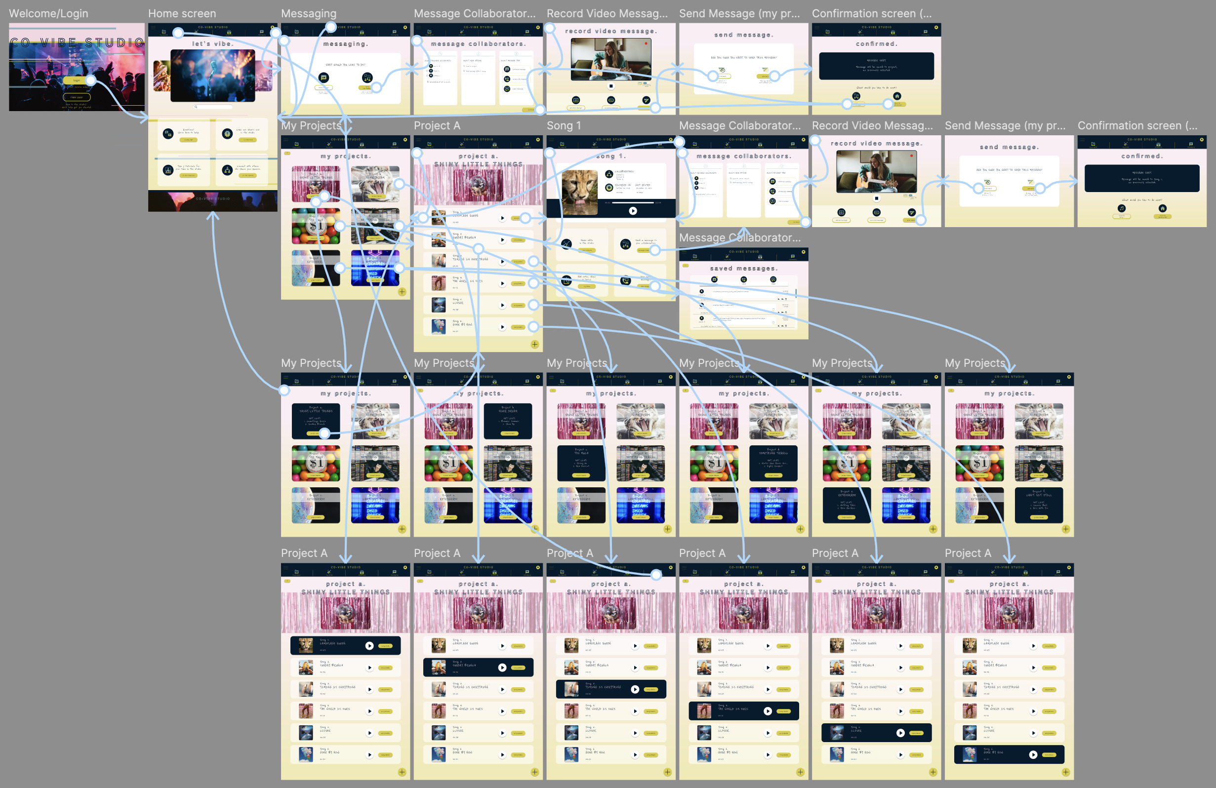
Now, when users are brought to the Home screen, they can immediately start the task of sending a video message to a collaborator by tapping the "Messages" button, located on the top navigation bar. The user is then prompted to either send a new message or view saved messages. After electing to send a new message, the user is taken to a screen where they select their message recipients, whether or not to save the message and where, and the method for communication. The user clicks on "Video Message", where they are taken to a screen where they can record a message using video and audio features. From there, the user can elect to "Send Message", and is greeted with a confirmation screen that asks whether they are sure they want to send their message. When the user confirms submission, they are presented with a final screen to notify them that their message has been sent.
high-fidelity mockups and prototypes
-
Mockups
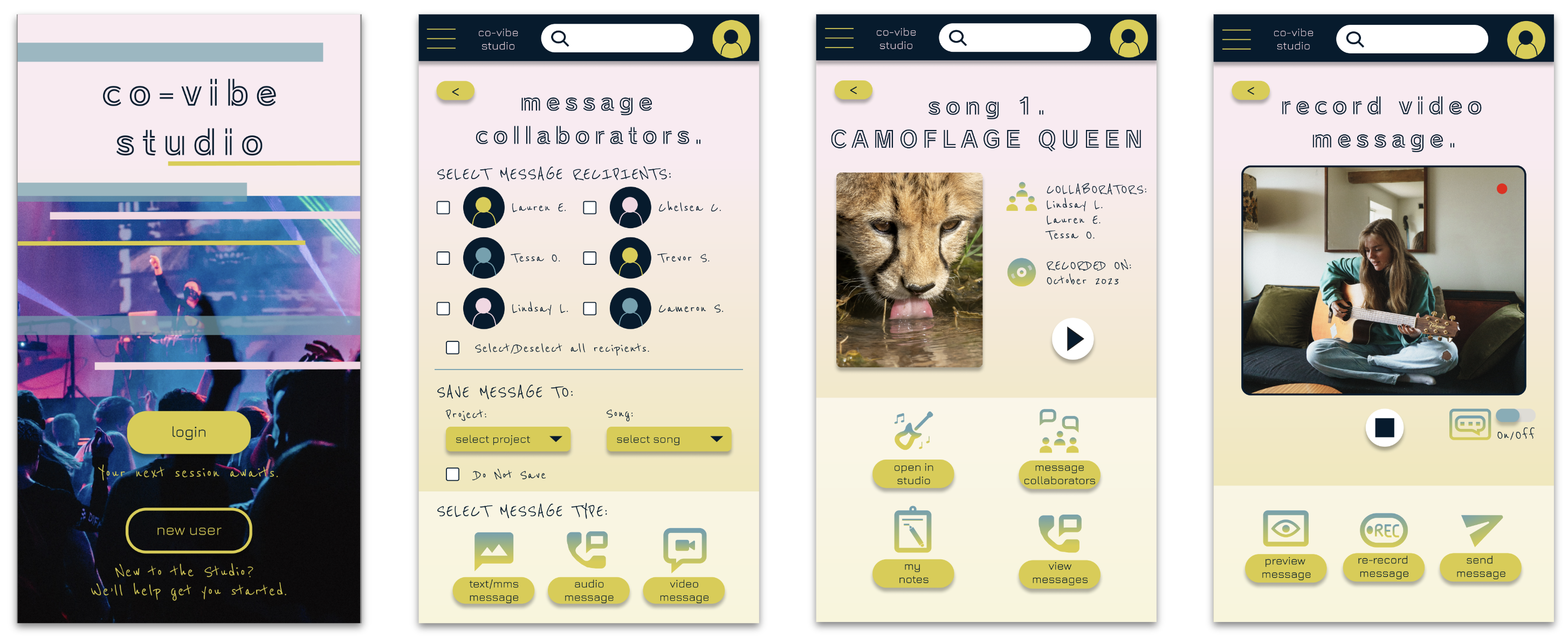
I included considerations for additional screen sizes in my mockups based on my mobile app designs. Since users may create and communicate from a variety of devices, I felt it was important to include a desktop version to give users choice and agency over their experience.
-
High-Fidelity Prototypes
Testing the new prototype with users to identify any pain points (and determine possible changes for the user flow) led me to conclude that this updated user flow creates a more enjoyable experience for the user, as they are able to quickly and easily locate the app’s communication features.
The prototype now features bright, energizing colors, unique icons to complement all buttons and call-to-action items, engaging and interactive animations for items where the user hovers over them before making their selection, clickable check boxes on the Message Collaborators screen, and a new screen for saved messages (organized by tabs for a polished look).
HiFi Prototypes:
accessibility considerations
-
1
I included communication features that allow users to exchange ideas using their preferred method (text, audio, and/or video) and in their preferred language. Users can employ auto-captioning to assist them in effectively communicating with their collaborators.
-
2
I included an icon with every call-to-action button, as well as imagery throughout my design to aid user’s understanding of the functional elements on each page.
-
3
I employed color combinations that are visually engaging and play to the energy and excitement of the Co-Vibe Studio brand. All color selections were tested for contrast and meet Web Content Accessibility Guidelines (WCAG).
going forward
Testing the hifi prototype with users, both in and outside of the target user group, will inform the next stages of this project.
takeaways
-
Impact:
My target users shared that the design was easy to use and navigate, and visually engaging with the use of bold colors and imagery/iconography. Users agree that the communication features developed with the design of the Co-Vibe Studio app would be useful to many who wish to collaborate with other musicians on the app.
-
What I learned:
I learned that the design process is all about iteration, and that the user experience can almost always be enhanced or improved in some way. The most important lesson I learned is to put the user’s needs first, and to let those needs inform any changes and/or additions to the product design. Now that users are able to successfully complete the main user task of sending a video message to one of their project collaborators, I will focus on creating additional screens and features to build out the rest of the online ordering app.
next steps
1
Develop additional aspects of the app, including a user profile section and user preferences/settings, to allow users to customize their experience.
2
Change Homescreen carousel images to user’s project/album covers, and make them clickable to take user directly to a specific project, to provide users a more personalized experience.
3
Expedite the messaging process by condensing screens 3 & 4 (“Messaging” and “Message Collaborators”) onto a single screen, and include a “Send New Message” feature at the top of this screen to provide users the best possible experience.